Chapter 13: Cartography, Visualization, and Spatial Communication

Cartography is the practice of making spatial information understandable. In software, it becomes interface design, visual encoding, interaction design, uncertainty communication, and ethical communication.
Learning Goals
- Understand maps as interfaces, analyses, and arguments.
- Apply cartographic design principles to software products.
- Choose appropriate map types for different data and audiences.
- Communicate uncertainty, scale, and limitations.
Theory
Maps select, simplify, classify, and emphasize. They never show everything. A good map makes the right spatial pattern visible for a specific task while making its assumptions clear.
All maps lie because all maps are reductions of the world. Projection, scale, classification, symbol size, color, label placement, and layer ordering all distort reality in some way. The ethical goal of cartography is not to make a map that tells no lies; it is to choose the most useful, honest, and simple distortion for the question being asked. The cartographer's job is to make complex spatial information understandable without pretending that the map is the territory.
"Pictures are worth a thousand words and maps are worth a thousand pictures."
Software engineers should treat cartography as part of product design. Color, labels, scale, interaction, legends, filters, and defaults influence what users notice and what decisions they make.
Cartographic design research gives us a practical rule: symbols are not decoration; they are a visual language. Bertin's work on graphic variables, Brewer's work on color schemes, MacEachren's work on map cognition and uncertainty, Monmonier's work on map rhetoric, and Slocum's thematic cartography research all point to the same engineering lesson: every styling choice changes what the user can see, compare, remember, and trust. Before choosing a basemap, color ramp, symbol library, or dashboard layout, ask:
- What decision or understanding should this map support?
- Who is the audience, and what geographic knowledge do they already have?
- What data type is being mapped: nominal categories, ordered classes, numeric quantities, rates, densities, flows, uncertainty, or time?
- What must be visible first, second, and third?
- What can be generalized, filtered, hidden, or moved into interaction?
flowchart TD
    A[Purpose and audience] --> B[Data type and scale]
    B --> C[Choose map type]
    C --> D[Choose visual variables]
    D --> E[Design symbols, color, labels, and legend]
    E --> F[Test readability and accessibility]
    F --> G{Does the map answer the question?}
    G -- Yes --> H[Publish with limitations and metadata]
    G -- No --> B
Cartographic Visual Variables
Jacques Bertin's visual variables remain one of the clearest ways to think about map styling. A visual variable is a property of a symbol that can carry meaning.
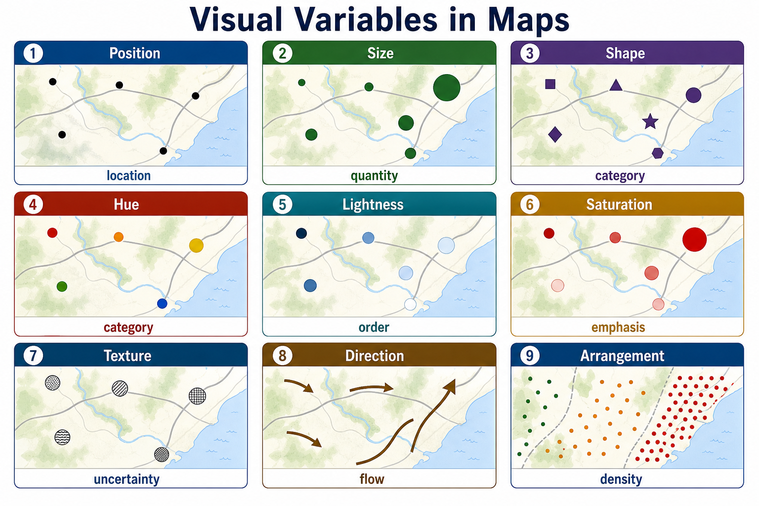
| Visual variable | Best for communicating | Example |
|---|---|---|
| Position | Location, adjacency, pattern | Parcel boundaries, sensor points, bus stops |
| Size | Quantity, magnitude, importance | Larger circles for higher population |
| Shape | Category or feature type | Different icons for schools, hospitals, and libraries |
| Color hue | Category or identity | Land use classes, political districts, transit lines |
| Color value/lightness | Ordered magnitude | Light-to-dark ramp for poverty rate |
| Color saturation | Emphasis or intensity | Muted background layers, saturated alerts |
| Texture/pattern | Category, uncertainty, print support | Hatching for proposed zoning or flood uncertainty |
| Orientation/direction | Flow, movement, aspect | Arrows for wind, slope aspect, traffic direction |
| Arrangement | Density, clustering, distribution | Dot-density maps and gridded hex bins |
Good styling matches the visual variable to the data. Ordered data should usually use ordered visual variables such as size, lightness, or sequential color ramps. Categorical data should use unordered variables such as hue or shape. Directional data needs orientation, arrows, streamlines, or animated flow. Uncertainty should be shown directly with transparency, fuzzier boundaries, hatching, confidence bands, or explicit reliability classes.
Visual variables do not merely decorate a map; they tell the reader what kind of comparison to make. If the question is "Which county has the highest rate?", color lightness works better than random hues. If the question is "Where are the largest totals?", proportional symbols may communicate more directly than a choropleth. If the question is "What category is each place?", hue and shape help the reader separate types. If the question is "Where is the data less certain?", hatching, transparency, or softened boundaries keep uncertainty visible instead of hiding it in a footnote.
flowchart LR
    A[Data Meaning] --> B{Data Type}
    B -->|Category| C[Hue, shape, pattern]
    B -->|Order or rank| D[Lightness, size, ordered line weight]
    B -->|Quantity| E[Proportional symbols, choropleth rates, graduated classes]
    B -->|Direction or flow| F[Arrows, orientation, tapered lines, animation]
    B -->|Uncertainty| G[Transparency, hatching, blur, confidence labels]
Symbol Types
Map symbols usually fall into three geometric families:
- Point symbols represent discrete locations such as wells, trees, crimes, stores, sensors, or address points. They can be simple dots, pictorial icons, proportional circles, clustered markers, or graduated symbols.
- Line symbols represent networks, boundaries, movement, and connections. Roads, rivers, trails, utility lines, migration paths, and bus routes can vary by width, color, dash pattern, casing, arrows, and opacity.
- Area symbols represent regions such as parcels, counties, watersheds, zoning districts, habitats, and service areas. They can use fill color, outlines, hatching, transparency, texture, and labels.
flowchart TB
    S[Map Symbols] --> P[Point]
    S --> L[Line]
    S --> A[Area]
    P --> P1[Dot: one location]
    P --> P2[Icon: feature category]
    P --> P3[Proportional circle: quantity]
    L --> L1[Width: hierarchy or volume]
    L --> L2[Dash: status or access]
    L --> L3[Arrow: direction or flow]
    A --> A1[Fill hue: category]
    A --> A2[Lightness: rate or intensity]
    A --> A3[Hatching: uncertainty or overlay]
Color, Size, Shape, Direction, and Style
Color is powerful but easy to misuse. Hue is excellent for categories, but it does not automatically imply order. Lightness is better for ordered values. Sequential ramps show low-to-high values; diverging ramps show distance above and below a meaningful midpoint; qualitative palettes separate named categories. For accessibility, avoid relying on red/green alone, check contrast, and make sure the legend explains the classification method.
Size is one of the most direct ways to show magnitude, but it needs careful scaling. A circle that represents quantity should be scaled by area, not radius, because viewers perceive the whole symbol. Very large symbols can hide neighboring features, so proportional-symbol maps often need transparency, outlines, clustering, or interactive inspection.
Shape works best for a small number of categories. Too many icons become a memory test. Simple geometric symbols are often more legible than detailed pictograms, especially on mobile screens or dense maps.
Direction communicates movement, flow, wind, slope aspect, traffic, network tracing, or change over time. Directional symbols should be visually lightweight unless direction is the main message. Arrows, tapered lines, animated particles, and oriented markers all imply motion, so they should be used only when movement or orientation is meaningful.
Style is the overall grammar of the map. It includes line weight, casing, label hierarchy, typography, opacity, basemap contrast, boundary treatment, haloing, simplification, and layer order. A good style creates visual hierarchy:
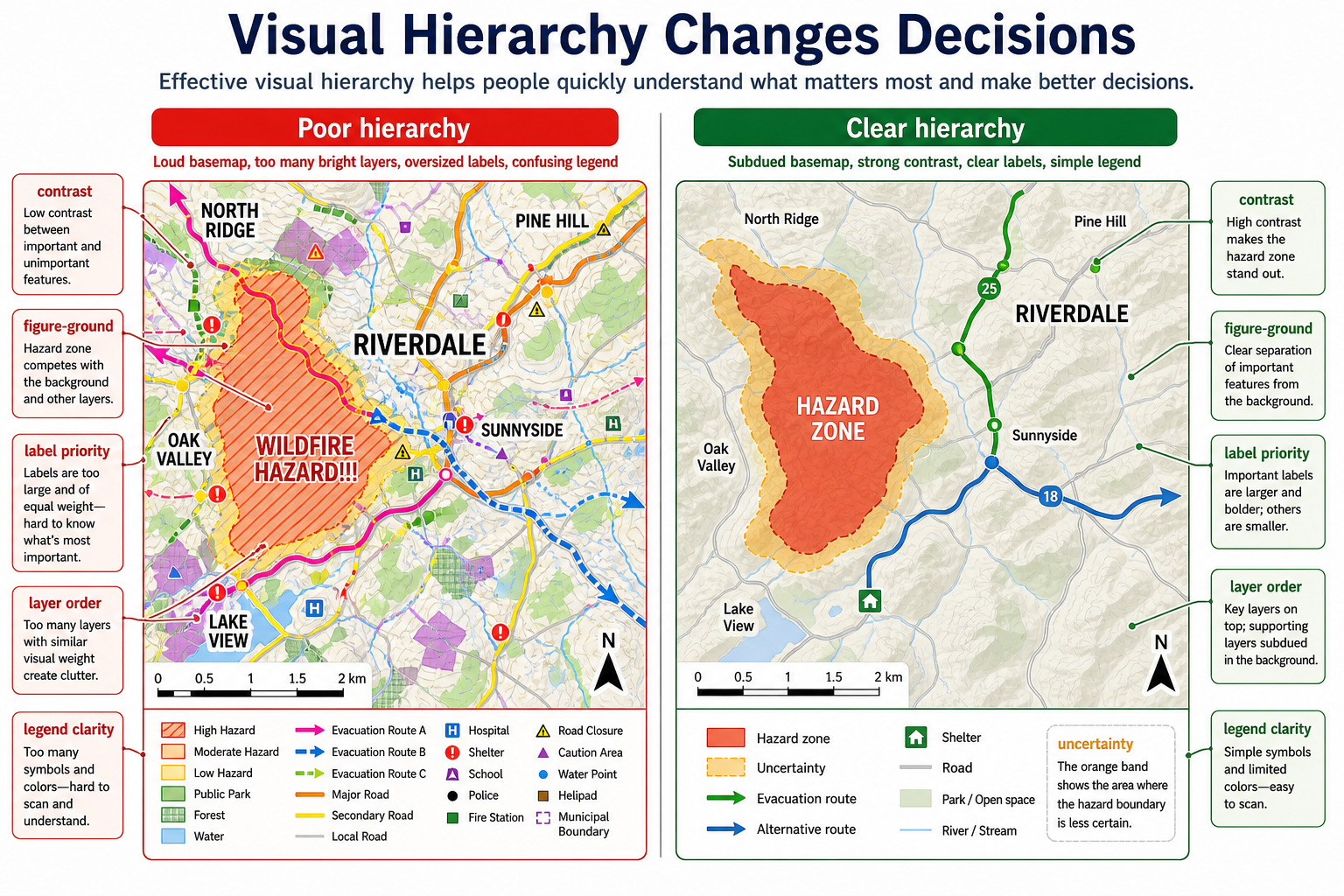
- The most important data is highest contrast.
- Context layers are quiet but readable.
- Labels support interpretation without covering the pattern.
- The legend uses the same visual language as the map.
- Empty space, muted colors, and omitted detail are treated as design tools.
Visual hierarchy is especially important in operational maps because the reader may be making a decision under time pressure. In an evacuation, utility outage, flood, wildfire, or incident-response map, the visual design should answer "What matters first?" before it answers "What else is nearby?" A subdued basemap, clear figure-ground separation, prioritized labels, consistent layer order, and a short legend can change whether a user sees the hazard, route, shelter, or uncertainty first.
Example Styling Decisions
| Mapping problem | Better cartographic choice | Why |
|---|---|---|
| County COVID cases | Map cases per 100,000 people with a sequential ramp | Rates compare places more fairly than raw counts |
| Land use categories | Use distinct hues with simple labels | Categories are nominal, not ordered |
| Income above/below median | Use a diverging ramp centered on the median | The midpoint has meaning |
| Earthquake magnitude | Use proportional circles with transparency | Magnitude varies continuously and points may overlap |
| Proposed flood zone | Use blue hatching over a subdued basemap | Pattern communicates overlay and uncertainty |
| Bike network comfort | Use line color and width by comfort class | Network hierarchy is easier to scan along lines |
| Evacuation flow | Use directional arrows or tapered paths | Direction and volume both matter |
Simple Design for Complex Information
The best cartographic designs are often the simplest designs that still preserve the important spatial relationships. Simplification is not laziness; it is communication. Cartographers simplify by selecting relevant layers, generalizing geometry, grouping categories, normalizing values, choosing meaningful classes, reducing visual noise, and writing legends that match the user's task.
flowchart TD
    A[Complex spatial reality] --> B[Select relevant data]
    B --> C[Normalize or classify values]
    C --> D[Generalize geometry for scale]
    D --> E[Encode with symbols and color]
    E --> F[Add labels, legend, source, and uncertainty]
    F --> G[Readable map for a specific audience]
A map of traffic safety, for example, might include every crash record, roadway centerline, speed limit, intersection, school zone, sidewalk, and traffic signal. A readable public map might instead show crash rates by corridor, highlight severe crash clusters, label only priority streets, and provide filters for time of day or crash type. The map lies by omitting thousands of details, but it tells a more useful truth about where safety interventions may be needed.
Math
Visualization relies on classification, normalization, color scales, density estimation, interpolation, symbol scaling, generalization, and perceptual ordering. A choropleth map often needs rates rather than raw counts. A heatmap is a smoothed model, not the original data.
Common cartographic calculations include:
- Normalization:
rate = event_count / populationordensity = count / area - Class breaks: equal interval, quantile, natural breaks, standard deviation, or custom policy thresholds
- Proportional symbols: scale circle area to the data value, so
radius = sqrt(value / pi)times a display scaling factor - Opacity and blending: use transparency carefully because overlapping features can create visual values that are not in the original data
- Scale-dependent styling: simplify geometry, hide minor labels, and change line weights as zoom level changes
Equation companion: Math and Algorithms Reference
Tools of the Trade
- QGIS, ArcGIS Pro, Mapbox Studio, Felt, Datawrapper.
- MapLibre GL styles, CartoCSS, SLD.
- D3, deck.gl, Observable, Vega-Lite.
- ColorBrewer, perceptual color scales, accessibility contrast tools.
Examples of Real-World Solutions
- A public health dashboard maps rates by population, not raw case counts.
- A transit map simplifies geography to improve route comprehension.
- A hazard map uses uncertainty bands and date labels.
- A planning map lets users compare zoning, parcels, transit, and flood risk.
- A topographic basemap changes label size, road hierarchy, and feature density by zoom level.
- A climate-risk map uses sequential color for probability and hatching for model uncertainty.
- An evacuation map uses visual hierarchy so hazard zones and safe routes stand out from background context.
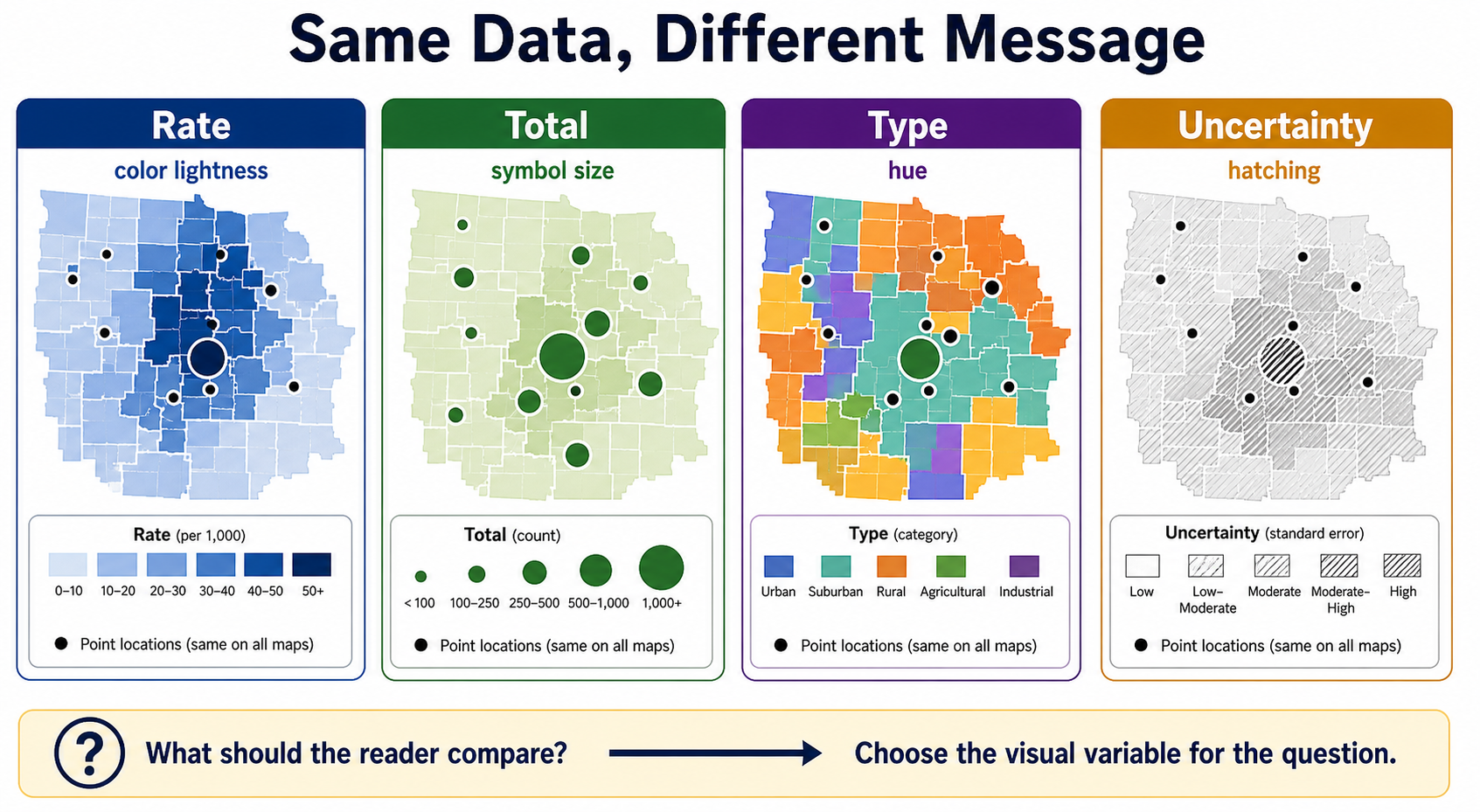
- A public dashboard uses one visual variable for each message: color lightness for rate, symbol size for count, and hatching for uncertainty.
Working Practice Examples
- Make a choropleth map using both raw counts and normalized rates. Compare the message.
- Design a legend for a flood-risk map with uncertainty.
- Create a map style that remains readable at neighborhood and city scale.
- Evaluate a map for color blindness and mobile readability.
- Redesign a crowded point map using clustering, proportional symbols, filtering, or hex bins.
- Build three versions of the same thematic map using sequential, diverging, and qualitative palettes. Explain which one matches the data.
- Take one dataset and map it four ways: rate by color lightness, total by symbol size, type by hue, and uncertainty by hatching. Explain how the message changes.
- Redesign a map with poor visual hierarchy by reducing basemap contrast, simplifying the legend, and changing label priority.
Common Failure Modes
- Mapping raw counts when rates are needed.
- Choosing color ramps that imply false ordering.
- Hiding uncertainty.
- Using too many layers at once.
- Making labels unreadable at key zoom levels.
- Scaling proportional symbols by radius instead of area.
- Using icons that are too detailed to read at normal map scale.
- Letting a loud basemap compete with the thematic data.
- Designing for desktop while ignoring mobile touch targets, small legends, and reduced screen space.
- Using map defaults without checking whether the defaults support the map's argument.
- Using several visual variables at once without deciding which one should dominate.
- Making every layer equally bright, equally labeled, and equally important.
- Using a legend that does not match the actual symbols, colors, line weights, or patterns on the map.
Works Cited
Bertin, Jacques. Semiology of Graphics: Diagrams, Networks, Maps. Translated by William J. Berg, U of Wisconsin P, 1983.
Brewer, Cynthia A. Designed Maps: A Sourcebook for GIS Users. ESRI Press, 2008.
Brewer, Cynthia A., Geoffrey W. Hatchard, and Mark A. Harrower. "ColorBrewer in Print: A Catalog of Color Schemes for Maps." Cartography and Geographic Information Science, vol. 30, no. 1, 2003, pp. 5-32.
MacEachren, Alan M. How Maps Work: Representation, Visualization, and Design. Guilford Press, 1995.
MacEachren, Alan M. "Visualizing Uncertain Information." Cartographic Perspectives, no. 13, 1992, pp. 10-19.
Monmonier, Mark. How to Lie with Maps. 3rd ed., U of Chicago P, 2018.
Slocum, Terry A., et al. Thematic Cartography and Geovisualization. 4th ed., Pearson, 2022.
![]()